This spring has been cooler than usual. Warmer, more springlike temperatures, are here. Forecasters are predicting next week the thermometer will hit the high 80s. Here’s a way to beat the heat.
Sights and Insights
This spring has been cooler than usual. Warmer, more springlike temperatures, are here. Forecasters are predicting next week the thermometer will hit the high 80s. Here’s a way to beat the heat.
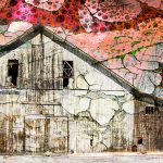
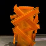
I am exhibiting these pieces at the Farm Earth Exhibit at Studio B, 39A Philadelphia Ave, Boyertown, PA.
Never in a million years would I have thought about a Dog Training facility as a venue to display art—mine or anyone else’s—until last spring some friends invited Martha Ressler and me to their opening at Awesome Dawgs. A marriage of a dog trainer and a gallery owner resulted in this interesting amalgam in a renovated barn bordering the Oley Valley. At that time we began negotiating our own show there.
The opening last week of our show Layers in Common was a bit unusual in that the guests included a number of furry four-leggers in various shapes and sizes along with their human companions. It was an art opening and a dog social all in one.
Our show was a bit different in another regard. This is the first gallery show that Martha and I’ve done together. Often we both participate in group shows, sometimes hang a solo show, or occasionally one of us teams up with another artist to share gallery expenses. (We do many art fairs together or side by side.)
Several people have requested that we post the show online. As it turns out, this is a good exercise because it reveals a disconnect between what I actually show in galleries or other venues and what appears in this weekly blog. Several pieces have been shown one place or another, but not here. Martha has posted her half of the show under the title Awesomeness on her blog, here. Below is my artist statement for this show in which I discuss the somewhat disparate selection of pieces.
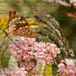
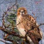
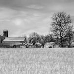
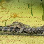
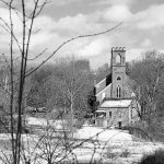
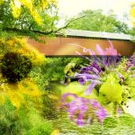
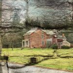
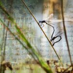
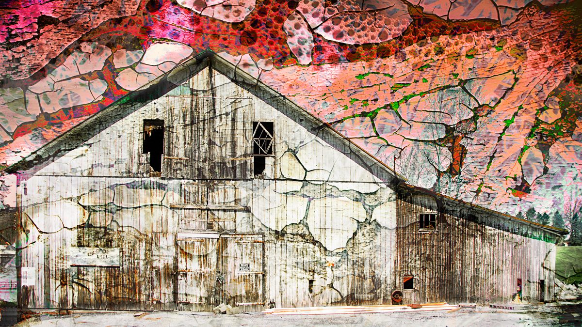
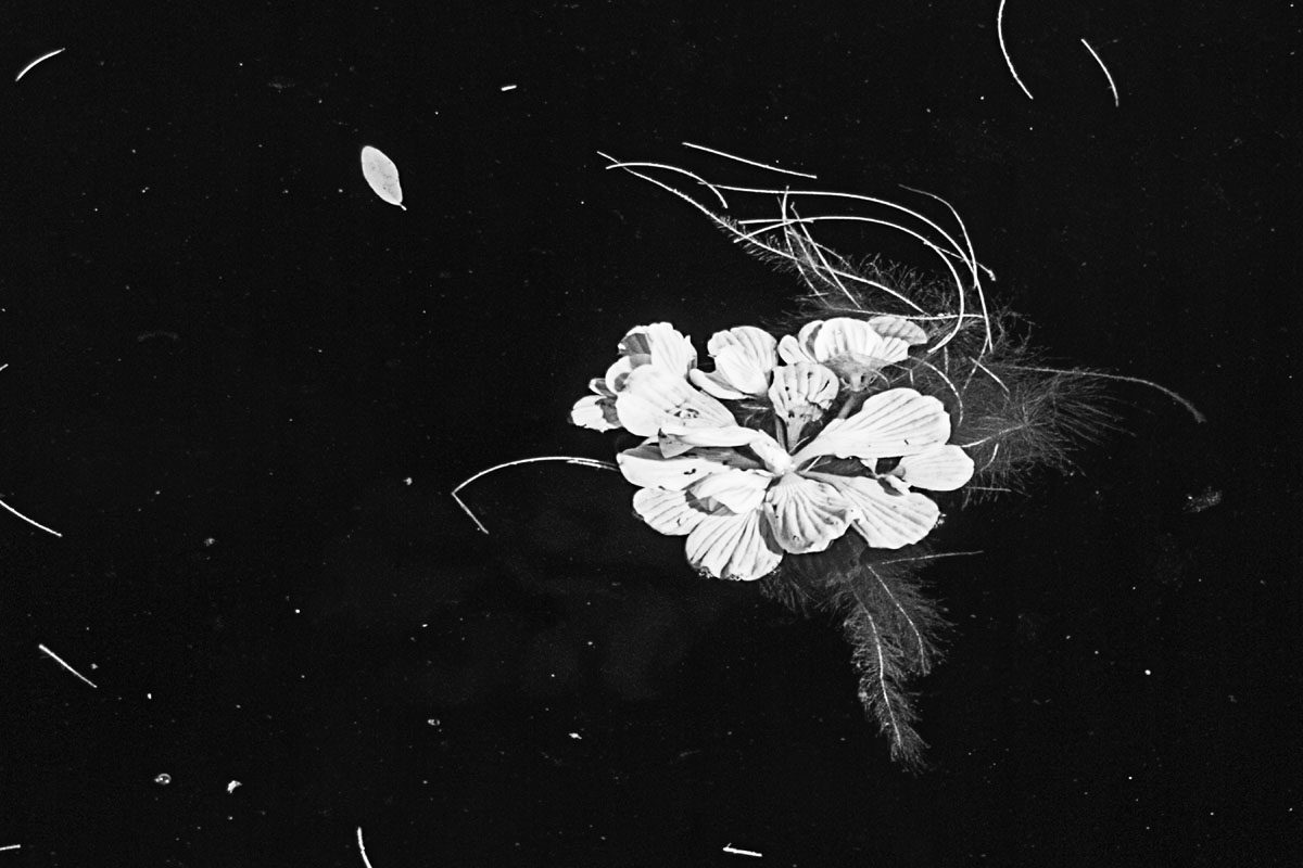
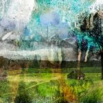
Words about Layers in Common — Anchoring my selections for this show are four pictures from my Love Letters series, a group of pictures incorporating photos of wildlife with love letters I’ve found in various places, mostly on the Internet, blended into the background. Four more are from two parallel series I’m currently working on Country Roads and Country Too. The former is a grouping of composite photos the latter black and whites. Both series are based on rural Berks County landscapes. Quarter Past Midnight rounds out the locally-sourced pictures. Water Lettuce, an infrared picture shot on Coffeepot Bayou in St. Petersburg, FL, is something of an outlier in this exhibit. It was chosen for purely aesthetic reasons to hang next to Quarter Past Midnight and like Hard Look bookends the exhibit with black mats.
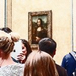
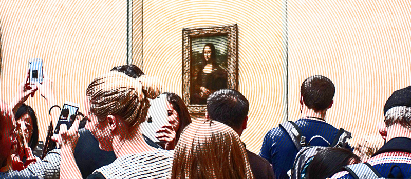
I was recently tasked with sending out a notice to the Berks Art Alliance of an upcoming art exhibit entitled “Make Art Great Again: Right, Left & In-Between Today’s Political World,” with only text provided. I scratched my head trying to come up with an appropriate graphic and tinkered with a 2014 photo I had shot in the Louvre to give it a pseudo-Roy Lichtenstein Pop Art look.
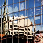
Though I rather liked the resulting picture, I didn’t end up using it for that project—choosing instead an old satirical political cartoon. The two other pieces included here are digital Pop Art style images printed on heavy watercolor paper, coated with encaustic medium, and mounted on deep birch painting panels. Upon Photography No. 37 and Upon Reflection No. 10 will be included in an exhibit “Reflections” at West Reading Tavern by members of Art Plus Gallery, which will be hung September 11, 2017. Upon Reflection No. 10 was created in 2010 and has been shown on a number of occasions.
It was created using a filter in a PhotoShop add-on in Nik Color Efex 3.0. That particular filter is no longer available in the current version of the Nik suite. Upon Reflection No. 37 was shot in 2011. As with Mona Lisa Madness, I created it using a combination of tools in Photoshop without the benefit of pre-constructed filters.
Anyone who knows about my photography, knows I nearly always shoot in Camera RAW. Why? Better control over the finished product. Old school film photographers often went to great lengths with special lens filters, reflectors and gels to get detail in the shadows without blowing away light areas in a picture. Then there were chemical baths and other darkroom tricks needed to get the desired results.
While I admit I could stand to learn more about using those tools, unless you are doing specialized work much is rendered unnecessary when taking full advantage of the digital toolbox offered with Camera RAW, which up until recently was only available with DSLRs. Now, some of the higher end smartphones offer RAW capture.
The problem with JPEGs is a lot of data captured by the sensor is thrown out by the low-powered computer in the camera based on algorithms and guess-work operator adjustments on camera.
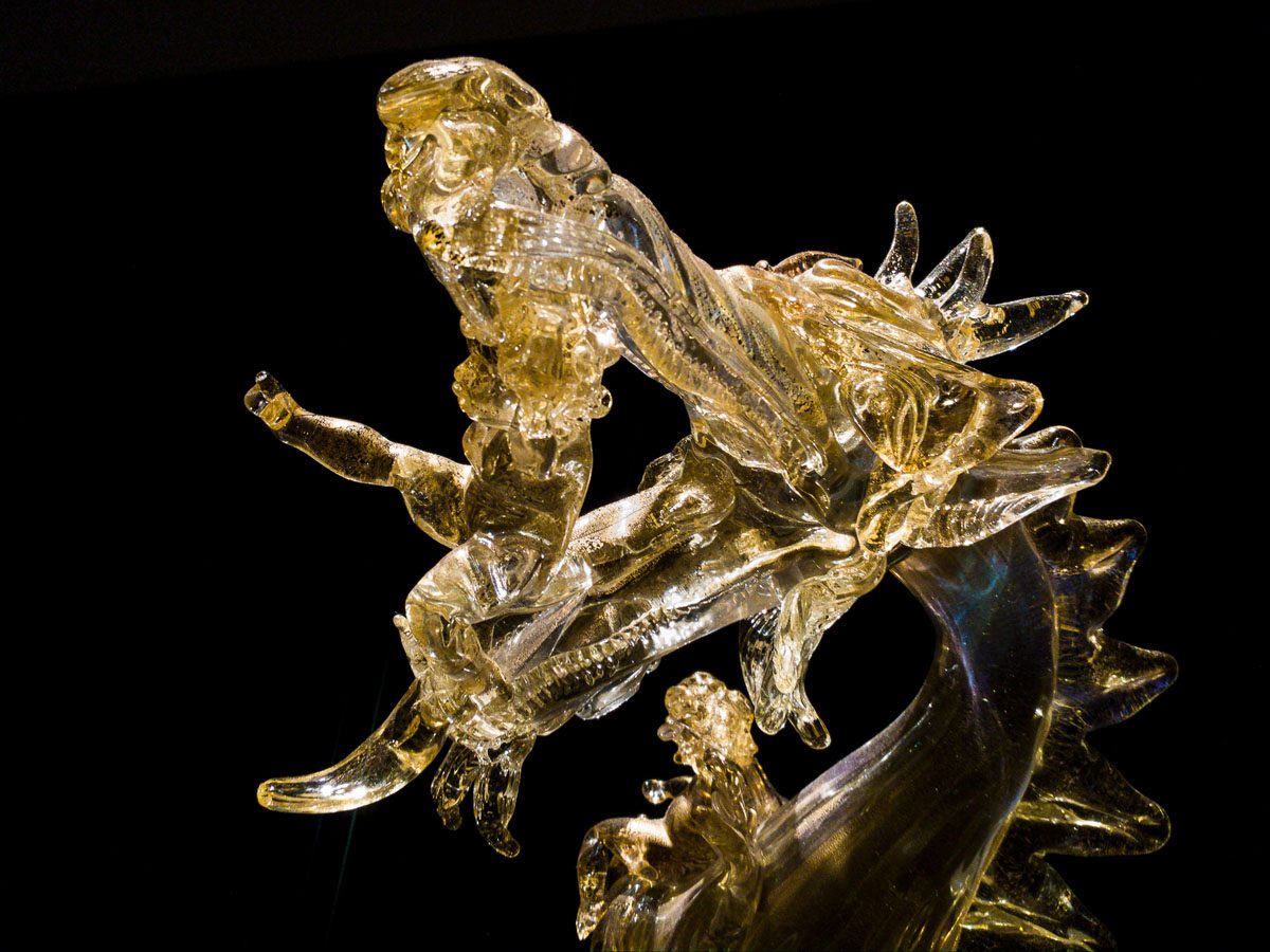
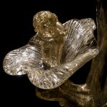
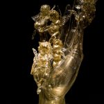
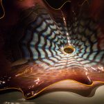
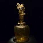
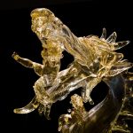
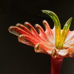
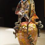
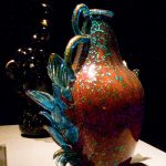
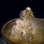
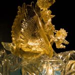
I decided to use an exhibit of Dale Chihuly’s Venetian Glass at the Reading Museum as a test of the capabilities of RAW capture on an LG-G5 Android phone. (Most manufacturers now have one or two top-end models that offer a manual mode with RAW-capture capability.) The Chihulys are a bit of a challenge because reflections on facets of the glass work tend to result in blown-out detail. I was pleased with the results, which required only minimal tweaking when developed using Adobe Camera RAW (ACR).
The pictures here were all shot in the phone’s manual dual-capture mode and are derived from the DNG captures, rather than from the JPEG clones. I developed them off-phone using ACR in Photoshop CC (2016).
Although there was noticeable loss of detail and clarity in the JPEGs, most of them were acceptable for posting on social media with little or no adjustment. They were also fine for making small prints. Because the zoom on cell phones is exclusively digital, the JPEGs have the advantage, from the point of view of instant use, of holding the zoomed crop. The RAW (DNG [Adobe’s Digital NeGative format]) files produced by the same shot were the full uncropped image.
In most cases, I used a low ISO and relatively fast shutter speed to limit noise and to maintain a nice dark black background.
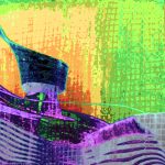
Detail can be recovered from clipped areas (especially in bright areas, but also in shadow) using ACR. The luminosity tool in ACR enables developing crisp, more vibrant colors in the pictures without over-saturation. In picture “VS987-8” I used an old “High Pass” Photoshop trick to enhance the structure of the vessel, which appeared a little flat in the original. The lens on the G5 is rated at f-1.8, making it good for low light situations. (The iPhone 7 has a considerably slower f-2.2 lens). Nevertheless, the aperture on these lenses is not adjustable like on a DSLR. While an 1.8 lens on a DSLR would create superior dimensionality, the short distance between the lens and the sensor and the small sensor size puts limits. The only way to control depth of field is by moving closer to the subject to blur the background. In a museum setting that isn’t always possible.
A Note about versions of ACR: Although Photoshop Elements (a tool for beginners and occasional photographers) comes with a stripped down version of ACR, it lacks a number of tools I consider essential (the Adjustment Brush is at the top of my list of must-haves), which are only available with the CC version or in Adobe Lightroom.
I’ve also found Google’s Snapseed App is a very good tool for developing both JPEGs or DNG files directly on a tablet or smartphone. But you are still dealing with the limitations of the processor and small screen on a phone compared with the higher powered processor and larger monitors on a desktop or laptop computer.